Optimizing & resizing images for Jekyll posts using Babashka
I’ve been tumbling down a rabbit hole for a little while now.
Feeling a desire to “write more” on my blog, motivated me to enhance the overall reading experience. However, customizing a Jekyll blog is not always easy due to the inherent limitations of the Liquid templating language and the modest amount of available plugins for GitHub Pages. Nevertheless, an improved reading experience led me to want a “featured image”. But images tend to affect webpage load speed… and speed matters. The featured image needed to be responsive and optimized, although doing it by hand made me shiver. Any manual repetitive process is boring and prone to errors. On top, it would remove the focus from writing. Suddenly I found myself scouring the internet for information about responsive images and semi-automating the image optimization process with a Babashka script interfacing with TinyPNGs API. 🐇🕳️
I could probably have gotten away with using a single optimized image and avoided the complexities that follow optimizing for multiple resolutions. But where is the fun in that - this was an opportunity to learn.
The following is divided into two sections describing:
- The essential information about “responsive images” and how the necessary Liquid template was created.
- A few of my thoughts behind the Babashka script for optimizing images using TinyPNG, and a link to the source code of the script.
Liquid template for responsive images
First I needed to know a bit more about images, and via MDNs article about Responsive images, I found an excellent series of blog posts named “Responsive Images 101” by Jason Grigsby.
It took a while for me to wrap my head around how the img-tag supports responsiveness. Two of its attributes play a key role and it boils down to srcset describing available resolutions, while sizes help the browser choose which resolution is the best option.
Both srcset (widths) and sizes are closely coupled with the layout in which the image is used. Thus blindly copy-pasting the following code will likely result in undesirable outcomes since it is tailored to my blog. But the approach should be fairly easy to replicate if you know a little about Liquid templating.
_includes/featured_image.html:
{% assign widths = "464,720,930,1440" | split: "," %}
{% assign ext = include.src | split: "." | last | prepend: "." %}
<img
  src="{{ include.src }}"
  srcset="
  {% for width in widths %}
    {{ include.src | replace: ext, '_' | append: width | append: ext }} {{ width }}w,
  {% endfor %}"
  sizes="(max-width:767px) calc(100vw - 2rem),
         (max-width:1024px) calc(100vw - 24rem),
         (max-width:1280px) calc(100vw - 28rem),
         720px"
  alt="{% if include.alt %}{{ include.alt }}{% else %}featured image{% endif %}"
  class="featured-image-post"
/>
To identify which widths I required for my layout, I carefully inspected how my layout changed when resizing the width of the browser. I concluded that I needed two resolutions (464 and 720) plus two additional resolutions (930 and 1440) for high-pixel density monitors (4K). This is due to how the sidebar is moved to the top on narrow screens, allowing to “reuse” higher image resolutions.
There are a few things worth noticing in the above Liquid snippet. It is impossible to define arrays directly in Liquid, so to work around this limitation all widths are comma-combined in a string and then split (into an array).
It is also not possible on GitHub Pages to use a regex-replace plugin (presumably for security reasons) but by leveraging the filters split, last, append & prepend, I was able to achieve a similar result. This also makes it possible to use different image types like png and webp for different featured images.
When specifying the value of sizes for the image tag, I tried to reuse the values (of max-width) and units (rem) that I found in my (slightly adapted) Jekyll theme.
The above featured_image.html is only guaranteed to work in the context of a post, but I decided to leave it as an “include” to reduce the amount of code in post.html:
_layouts/post.html:
  {% if page.image %}
    {% include featured_image.html
       src=page.image
       alt=page.image_alt %}
  {% endif %}
All that is left for me to do when writing, is optionally providing the following Front Matter:
image: /assets/img/awesome_image.png
image_alt: "AI generation prompt: Something awesome."
But wait! How do all the different (now necessary) resolutions of the featured image come to be?
Enter Babashka.
Babashka script for optimizing and resizing images
TinyPNGs API is awesome. Simple, easy to use, but still powerful. I had no experience with optimizing images before this, so I might be easily impressed.
I have shared my current generic implementation of a Babashka script for optimizing and resizing images using the TinyPNG API in a GitHub Gist. It took a few iterations to carve out the last hard coupled things.
The REPL experience in Clojure and Babashka are both a delight to work with. They each played a significant role in why the code turned out so nicely. Being able to easily iterate over small parts of the code in isolation is simply awesome.
For instance, it is possible to generate the HTTP request bodies for all the combinations of resizing, without actually making any requests to TinyPNGs API (no side effects):
> (request-bodies {:width "1440,930"
                   :resize-method "scale"
                   :type "image/webp"})
({:convert {:type "image/webp"}}
 {:resize {:method "scale", :width 1440}, :convert {:type "image/webp"}}
 {:resize {:method "scale", :width 930}, :convert {:type "image/webp"}})
When I cannot avoid side effects, I make an effort to place them in places that make the code easy to test. This is why the function calling the TinyPNG API for resizing (get-image-output), isn’t also saving the image to disk. I want to be able to tinker with how the images are saved (save-output-response) without making requests to the TinePNG API every time. By mocking a TinyPNG API HTTP response, this is straightforward:
(def response
  {:request {:body "{\"resize\": {\"method\": \"scale\", \"width\": 320}}"}
   :headers {"content-type" "image/png"
             "image-width" "320"
             "image-height" "270"}
   :body (io/input-stream (.getBytes "some bytes"))})

(save-output-response
  "images/panda-happy" ; NOTICE: without extension - deduced from response
  response)
With the script having finally been molded to my needs, I can now generate all the optimized variations of a featured image for my blog by running something along the lines of:
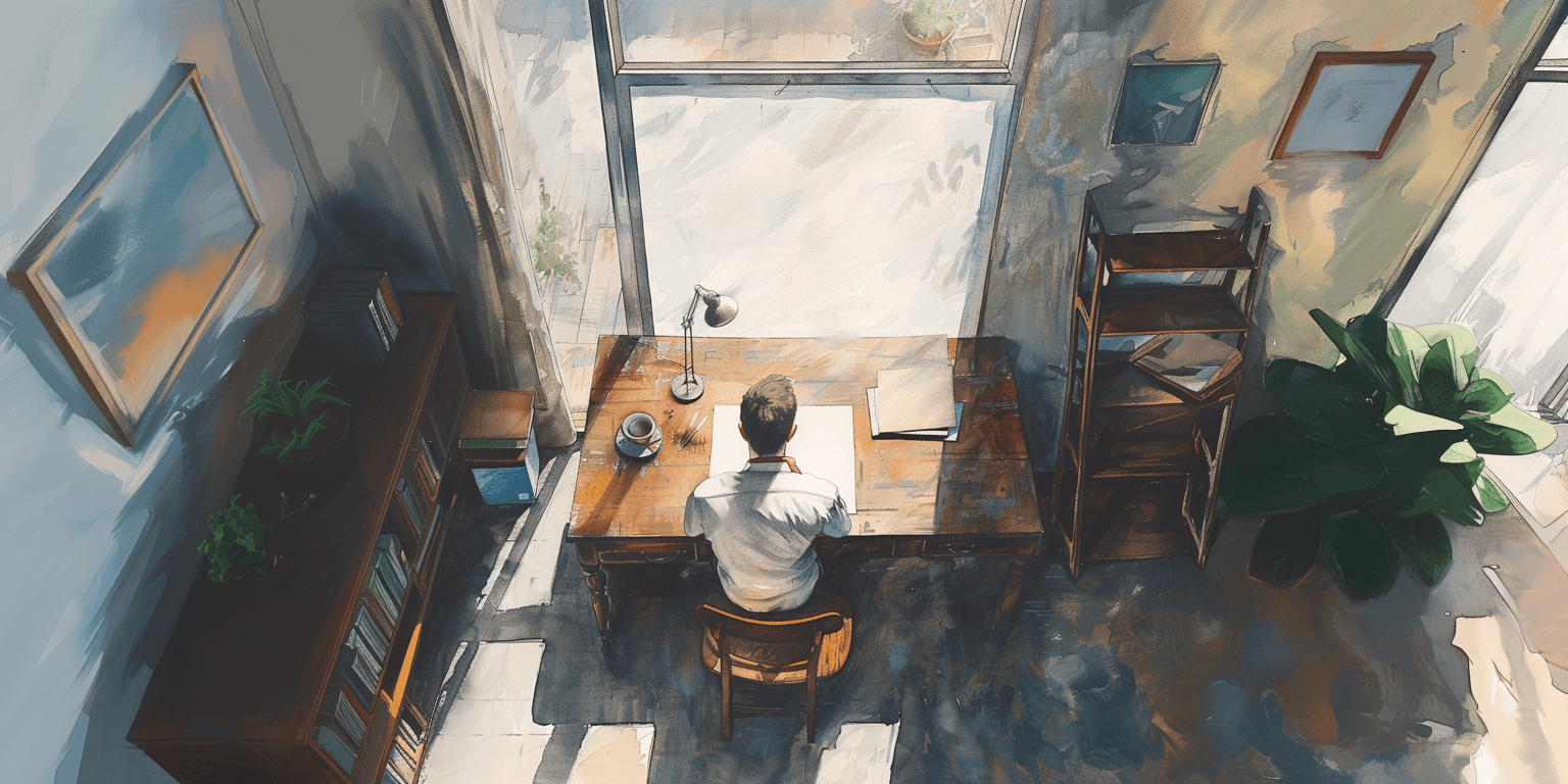
$ ./optimize_img.clj assets/img/orig/a_man_sitting_at_a_desk_with_a_blank_page.png assets/img/ \
  -k tinypng_api.txt -m scale -w 1440,930,720,464
Optimizing assets/img/orig/a_man_sitting_at_a_desk_with_a_blank_page.png
Saving assets/img/a_man_sitting_at_a_desk_with_a_blank_page.png
Saving assets/img/a_man_sitting_at_a_desk_with_a_blank_page_1440.png
Saving assets/img/a_man_sitting_at_a_desk_with_a_blank_page_930.png
Saving assets/img/a_man_sitting_at_a_desk_with_a_blank_page_720.png
Saving assets/img/a_man_sitting_at_a_desk_with_a_blank_page_464.png
In the example above, the TinyPNG API key is stored in a file named tinypng_api.txt in the “current directory” (the same directory as the Babashka script is run from). I am using a file to avoid having my API key in the terminal history. However, the code allows for providing the key directly as an argument:
-k aWprbG1ub3BxcnN0dXZ3eHl6MDEyMzQ1.
When no file exists with the name aWprbG1ub3BxcnN0dXZ3eHl6MDEyMzQ1 the script assumes that is instead the key.
I guess I am out of excuses - now it is back to writing 😅